
Improving the Usability of Substance Use Assessment Tools
Overview
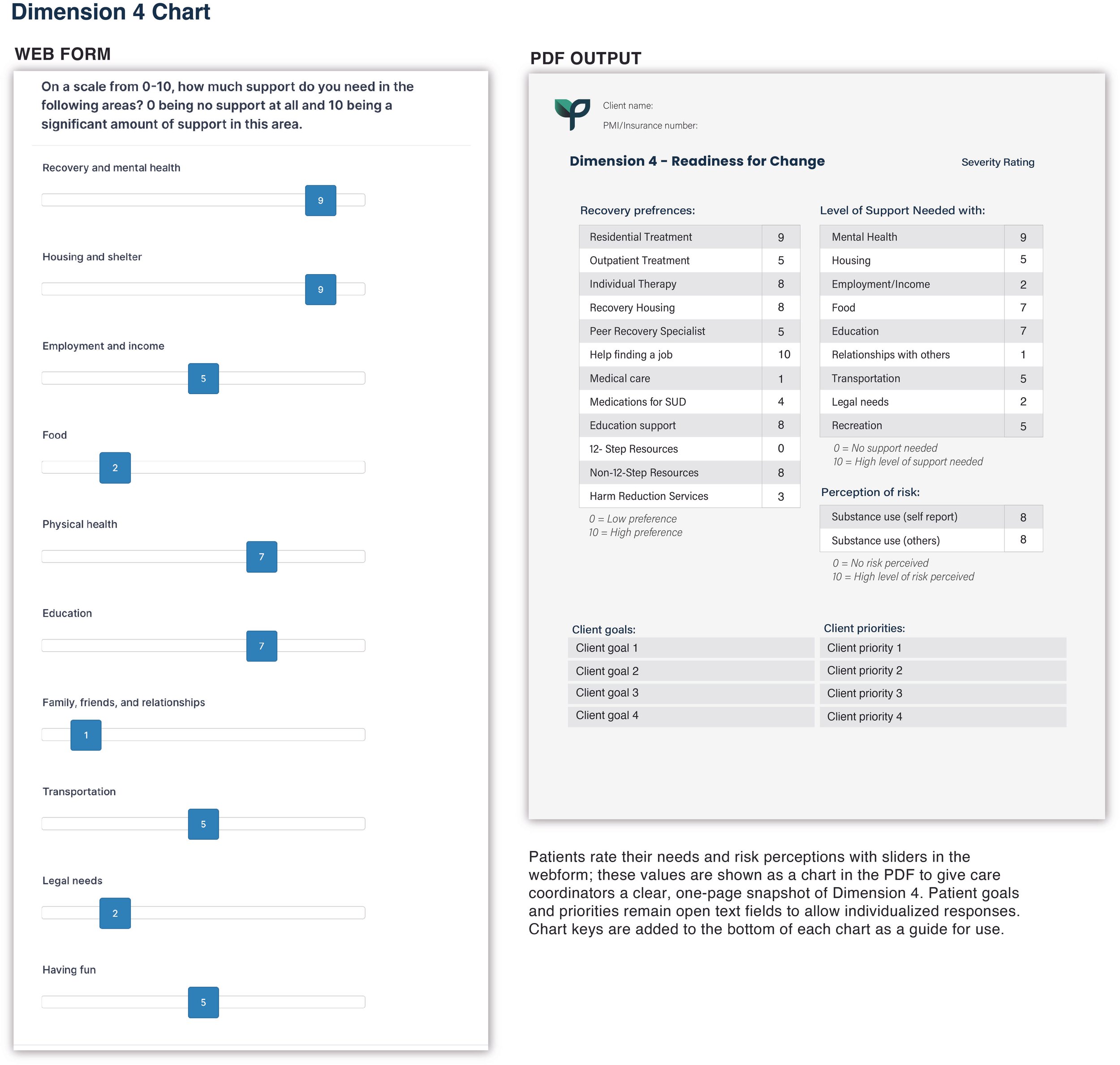
In this project, I designed and implemented a structured webform using a form-builder platform and mapped the collected data onto a custom, highly legible PDF output. The webform is used by licensed professionals to conduct substance use disorder assessments, and the resulting PDF is shared with treatment centers for review prior to patient admission. View the PDF output here
Opportunity Space
The assessment process required capturing extensive clinical information while producing a PDF that treatment centers could review quickly. The form-builder platform limited input flexibility, but the PDF output offered full design control—creating an opportunity to reorganize the information for clarity, hierarchy, and clinical usability.
Insights
From clinician interviews, co-design sessions, and usability reviews, several themes emerged:
Assessments must be comprehensive yet fast to scan during admissions.
Structured data is easiest to read when shown in grids, tables, or charts.
Narrative details need open, clearly labeled sections to support context-rich documentation.
Visual hierarchy directly affects decision speed, particularly for identifying risk factors.
Strong IA and design can overcome limitations of rigid form-builder components.
These insights guided a layout that balances detail, clarity, and review efficiency.
Design Decisions
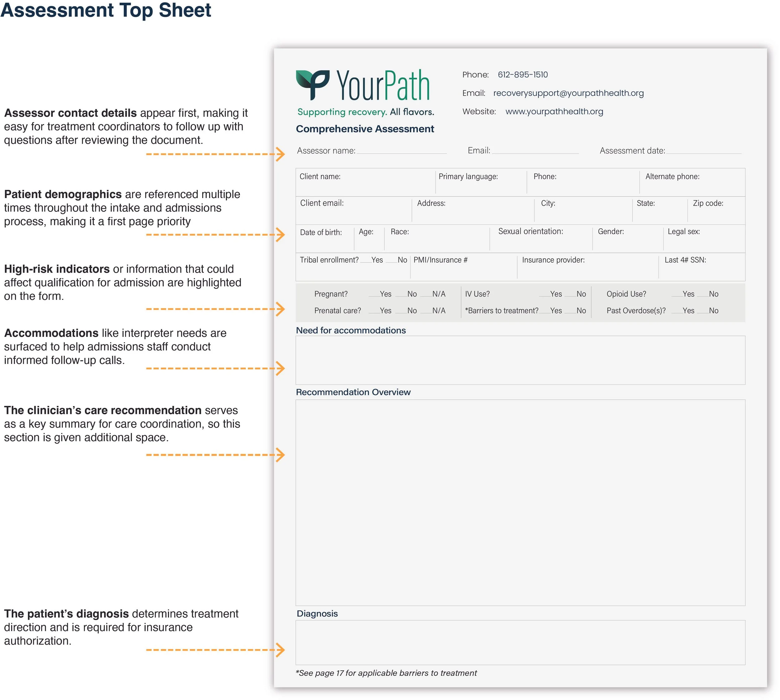
1. Prioritized visual hierarchy and information
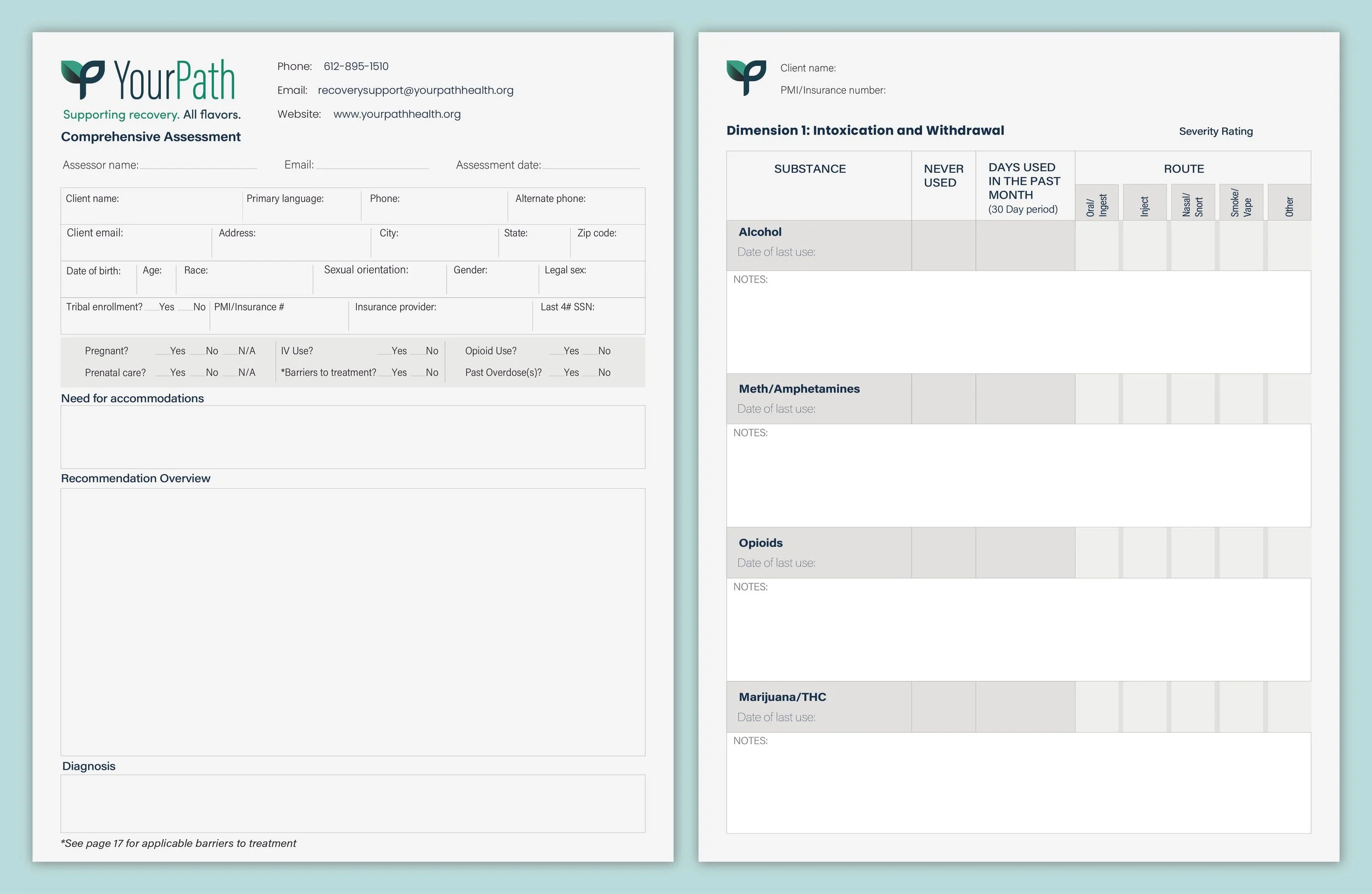
Clear headings, spacing, and section breaks guided clinicians through dense information with minimal effort. Information that is collected in disparate parts of the webform are re-arranged on the PDF so that they appear on the first page.
2. Open sections for narrative input
Ample whitespace and clear labels supported capturing nuanced clinical context without clutter.
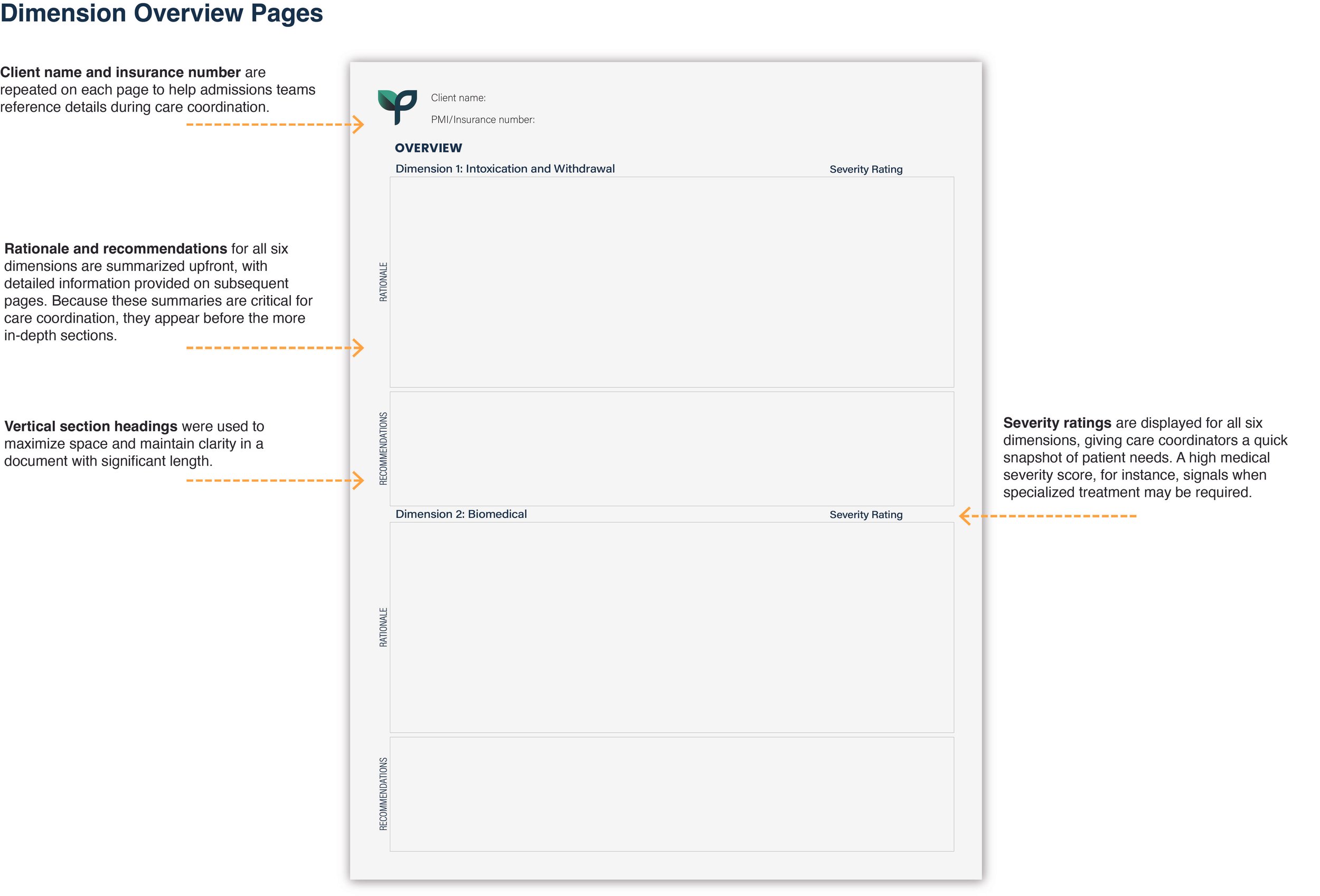
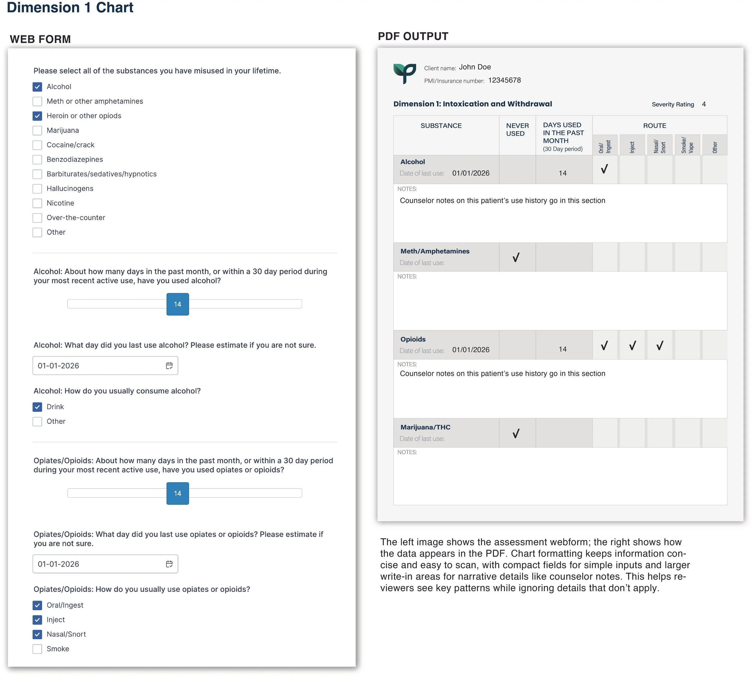
3. Visual organization of structured data
Grids, tables, and charts replaced long text responses (where applicable), making key details easier to interpret at a glance.
4. Designing beyond platform constraints
Despite limited input components, I optimized the PDF output to be clean, legible, and clinically intuitive.
Outcomes
The redesigned assessment workflow made the tool significantly clearer, faster to review, and easier for treatment centers to use:
Quicker clinical review: Improved hierarchy and structured data visualization helped coordinators scan assessments more efficiently.
More actionable information: Charts, grids, and narrative sections gave clinicians a clearer understanding of risks, needs, and patient priorities.
Better communication across teams: Reorganized sections and repeated identifiers reduced confusion when discussing cases.
Reliable readability in all formats: The PDF remained clear whether viewed digitally, printed, or faxed.
Stronger consistency across assessments: A standardized layout ensured all patient information was captured and presented uniformly.
Overall, the redesign transformed a dense assessment into a clean, clinically intuitive tool that supports faster decision-making and more coordinated care.